
A Guide to Choosing Fonts for Website Headers
When visitors land on your website, the first thing they notice is the header. It sets the tone for the entire page and establishes a visual hierarchy. The font you choose for your website header can have a significant impact on the overall user experience. It is crucial to select a font that aligns with your brand and enhances the readability and aesthetics of your website.
Importance of Fonts in Website Design
Fonts play a vital role in website design for several reasons. Firstly, they evoke emotions and convey your brand’s personality. Fonts can communicate a sense of professionalism, elegance, playfulness, or boldness, depending on the typeface you choose. Secondly, fonts greatly impact the readability and legibility of your content, ensuring that visitors can effortlessly consume the information on your website. Lastly, fonts contribute to the overall visual appeal of your website, creating a cohesive and engaging design.
Considerations for Choosing Fonts
When selecting fonts for your website headers, there are several essential considerations to keep in mind.
1. Reflect Your Brand Identity
- Your font choice should align with your brand’s identity and values. Consider the tone you want to convey, whether it’s modern, traditional, friendly, or authoritative. The font should complement your brand’s visual elements and reinforce your messaging.
2. Readability and Legibility
- One of the primary purposes of website headers is to communicate important information to visitors. Therefore, it’s crucial to select fonts that are highly readable and legible, even at different screen sizes and resolutions. Avoid overly decorative or intricate fonts that may hinder readability.
3. Compatibility with Different Devices
- In today’s digital landscape, users access websites from various devices, including desktops, smartphones, and tablets. Ensure that the fonts you choose are compatible with different devices and operating systems. Test the fonts across various platforms to ensure consistency.
4. Consistency Across the Website
- Maintaining consistency in font usage across your website is essential for creating a cohesive design. Choose a primary font for your headers and use it consistently throughout your website. Consistency will help establish a visual hierarchy and reinforce your brand’s identity.
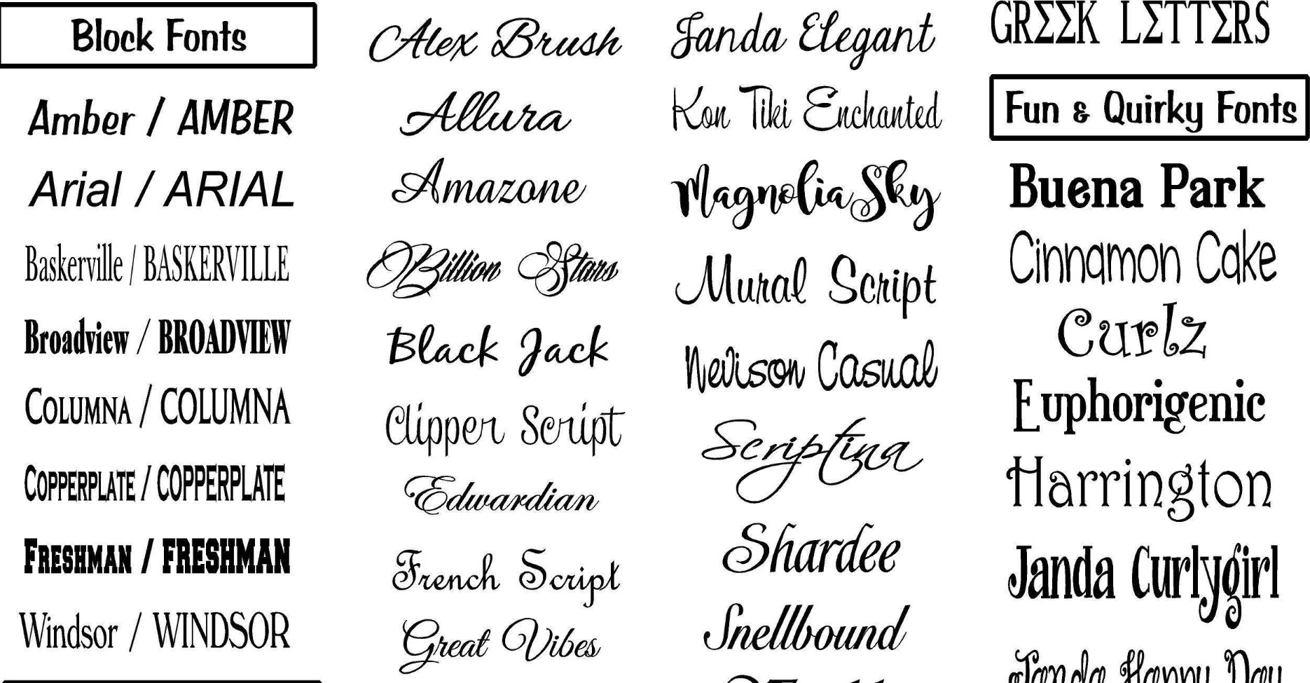
Serif vs. Sans Serif Fonts
When it comes to selecting fonts for your website headers, you’ll often come across two main categories: serif and sans serif fonts.
Serif Fonts
Serif fonts are characterized by small decorative strokes at the end of the letterforms, known as serifs. These fonts exude a more traditional and formal vibe. They are often associated withprint media and are considered to be more elegant and sophisticated. Serif fonts are a great choice for websites that want to convey a sense of tradition, reliability, or luxury.
Sans Serif Fonts
On the other hand, sans serif fonts do not have the decorative strokes at the end of the letterforms. They offer a more modern and streamlined look. Sans serif fonts are often associated with simplicity, minimalism, and a contemporary feel. They are widely used for websites that aim to convey a clean and straightforward design aesthetic.
Font Pairing and Hierarchy
Font pairing refers to the practice of combining two or more fonts in a harmonious way. It helps create visual interest and adds hierarchy to your website headers. When pairing fonts, it’s essential to choose fonts that complement each other while providing sufficient contrast. For example, pairing a bold, attention-grabbing font for the main header with a more subdued font for subheadings can create a visually appealing and balanced design.
In terms of hierarchy, your website headers should use different font sizes, weights, and styles to indicate importance and guide the reader’s eye. The main header (H1) should be the most prominent, followed by subheadings (H2), and so on. Establishing a clear hierarchy ensures that visitors can quickly scan the page and find the information they’re looking for.
Font Size and Weight
The font size and weight you choose for your website headers also play a significant role in the overall design and user experience. Larger font sizes can grab attention and make important information stand out, while smaller font sizes can be used for less significant details.
Similarly, font weight can be adjusted to create emphasis and contrast. Bolder weights can be used for main headers or important statements, while lighter weights can be used for subheadings or supporting text. Finding the right balance between font size and weight is crucial for readability and aesthetics.
Contrast and Color
Contrast is a key element in designing effective website headers. It ensures that the text is easily distinguishable from the background and enhances readability. When selecting fonts, consider the contrast between the font color and the background color. High contrast can make the text pop and improve legibility, while low contrast can make it difficult to read.
Additionally, color can be used strategically to reinforce your brand’s identity or create visual interest. Experiment with color combinations that align with your brand’s color palette and evoke the desired emotions.
Testing and Optimizing Fonts
Before finalizing your font choices for website headers, it’s essential to test them thoroughly. Pay attention to how the fonts render on different devices and browsers. Ensure that the fonts load quickly to prevent delays in page loading times.
Testing and optimizing your fonts will help you identify any issues with readability, legibility, or compatibility. It’s crucial to provide a seamless experience for all users, regardless of the device they’re using to access your website.
Common Mistakes to Avoid
When choosing fonts for website headers, there are some common mistakes that you should avoid:
- Overusing decorative or novelty fonts that compromise readability.
- Using too many different fonts, which can create a chaotic and unprofessional design.
- Neglecting the importance of font hierarchy, resulting in a lack of visual structure.
- Failing to consider accessibility guidelines, such as ensuring sufficient color contrast for users with visual impairments.
- Ignoring user feedback and analytics data that can provide insights into the effectiveness of your font choices.